prompt topic
Menu and navigation prompts
Answer in brief
A menu or navigation prompt works when it gives the real items, shows how the active one is marked, and describes the whole cycle: closed, opening, open, moving between items, choosing and closing. Navigation is used with a keyboard as often as a pointer, so the keys belong in the prompt.
Start with the list. The number of items and the length of their labels decide the width, the density and whether groups are needed.
Give the items and their grouping
Write the labels as they will appear, in order, with groups and any shortcuts or counts. Seven short labels and twenty-five long ones are different designs. Say which items have an icon, and keep icons to one size and one stroke weight.
State the measurements that set the density: row height, horizontal padding, the gap between icon and label, and the width of the panel or rail.
Mark the active item once
The active item needs one clear signal: a filled pill behind it, a bar at its edge, a heavier weight. Choose one and describe it. The nicest detail in most menus is how that marker travels when the selection changes. Ask for it to slide to the new item over about 0.25 seconds instead of jumping.
Hover and keyboard focus are separate from active. Give each its own lighter treatment so three items never look selected at once.
Describe open, close and the keys
Say where the menu comes from and how: it grows from its button, slides from an edge, or fades in at the centre for a command palette. Give the duration and say the close is quicker than the open. Say what happens to the page behind: dimmed, blurred or untouched.
List the keys. Arrow keys move, Enter chooses, Escape closes and returns focus to the trigger. A command palette opens on a shortcut and filters as the user types. Ask for focus to stay inside an open menu.
What a menu or navigation prompt should contain
- The items: real labels, order, groups, icons, shortcuts.
- Density: row height, padding, panel or rail width.
- The active marker and how it moves between items.
- Hover and focus treatments, distinct from active.
- Open and close: origin, duration, easing, what the page does behind.
- Keys and touch: arrows, Enter, Escape, the shortcut, and the phone version.
A prompt to start from
Build a command palette for [product], opened from a search chip in the header and with a keyboard shortcut.

Stack: Vite + React + TypeScript, plain CSS with custom properties. No libraries.

Page behind it: a plain app shell on #f3f1ec with a 56px header. In the header, a chip 220 × 34px, radius 10px, fill #e8e5de: a search icon, "Search or jump to", and a key hint on the right.

Palette: 600px wide, max height 440px, centred horizontally, 18vh from the top. Fill #ffffff, radius 16px, 1px border #dedad1, shadow 0 24px 60px -20px rgba(0,0,0,0.35). The page behind dims with rgba(20,18,14,0.3).
- Top: an input row 56px tall, 17px text, placeholder "[Type a command]", a hairline under it.
- List: groups with 11px uppercase headings in #8c877d. Rows are 44px with 12px padding: an 18px icon, the label at 15px, and a shortcut on the right in small keycaps. Use these commands: [group 1: four commands], [group 2: four commands].

Selection: one row is always selected. Its marker is a rounded rectangle, radius 8px, fill #efece5, that slides to the new row over 0.18s with ease-out when the selection changes.

Behaviour: [Cmd/Ctrl + K] or a click on the chip opens it. Typing filters rows by a case-insensitive match on the label. No match shows "No commands for [query]". Arrow keys move and wrap, Enter runs the command (close the palette and show the command's name in a toast for 2s), Escape closes and returns focus to the chip. Focus stays inside while open.

Motion: open scales from 0.97 to 1 and fades in over 0.2s; close takes 0.12s. With prefers-reduced-motion, it appears and disappears with no scale and the marker jumps.

Phones: the palette becomes a full-width sheet from the top with 12px margins and 48px rows.

Run it. Open it with the shortcut, filter to one row, run it, and check 390px and 1440px.
Written for this page as a starting point; swap the parts in [brackets] for your own. The full prompt of each uberdesigner template is longer and specific to one finished design, and it is tested by rebuilding the template from the prompt alone.
Menus and navigation to start from
Finished menus on uberdesigner: a glass menu, a command palette, a scroll rail, a spine menu, a sidebar and a create menu. Glass menu is free.
-
glass menu
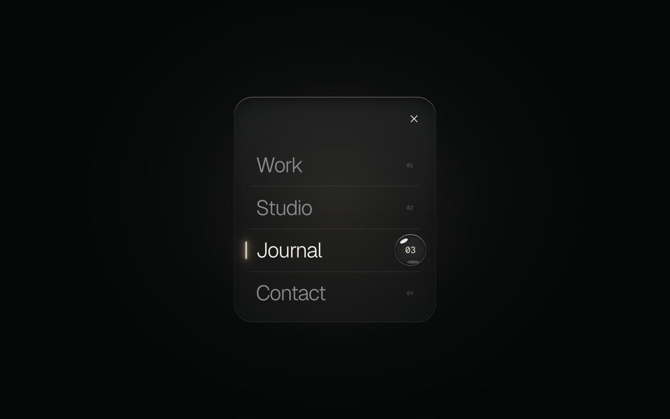
A burger button that grows into a frosted-glass menu, with a small liquid-glass lens that glides to the active item.
copy its prompt on uberdesigner -
command k
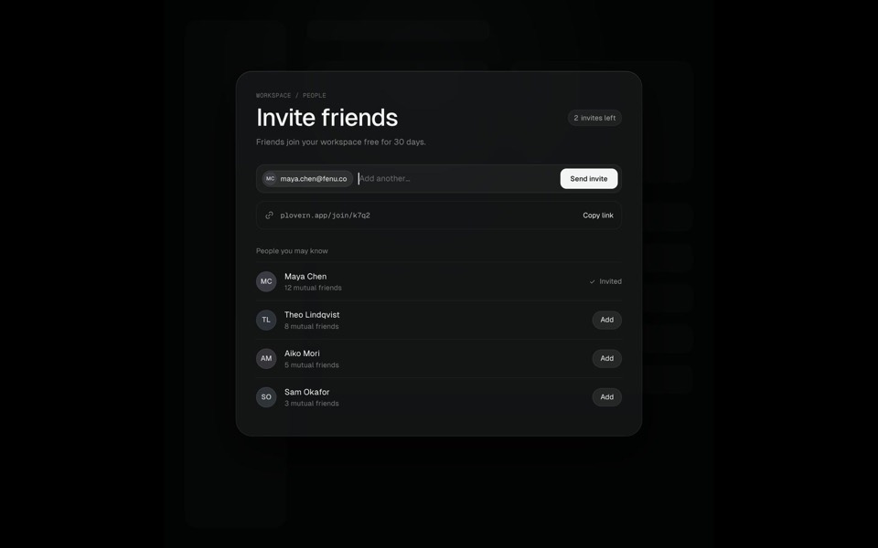
A Search ⌘K chip morphs into a command palette, typing filters six commands down to one, Enter grows that row into an Invite friends page where an invite is sent, and Esc folds it all back into the chip, on an 11-second loop.
see it on uberdesigner -
rail menu
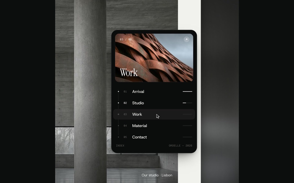
The scrollbar is the navigation: a photo capsule rides the rail, grows into the cover of an index menu whose dots fly over to become its timeline, rolls between photos as you hover, and folds back as the page jumps, on a 12-second loop.
see it on uberdesigner -
spine menu
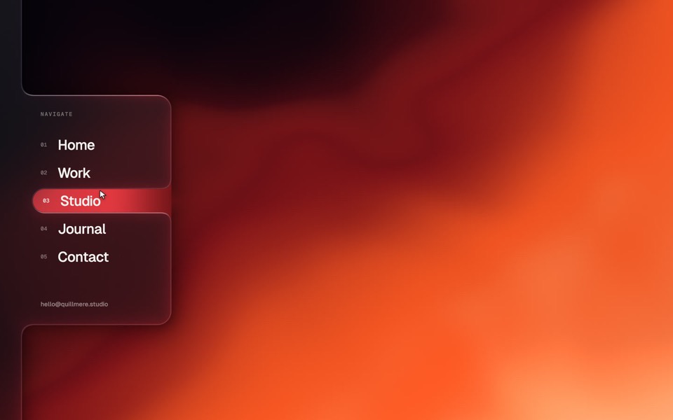
A website menu in a frosted-glass spine on the left edge: the Menu tab spills into a glass panel, the active item is a window cut in the glass, and choosing one floods the page with a new palette.
see it on uberdesigner -
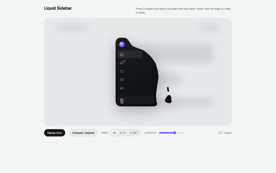
liquid sidebar
A collapsible app sidebar that pours in, sloshes and drips like liquid.
see it on uberdesigner -
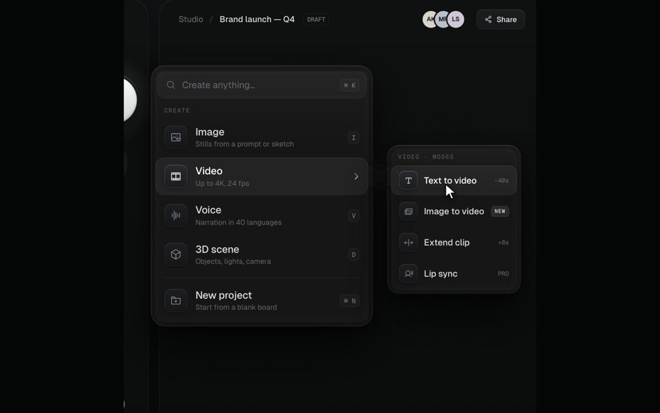
pour menu
A creative tool's Create menu that pours out of its + button as liquid and settles into glass.
see it on uberdesigner -
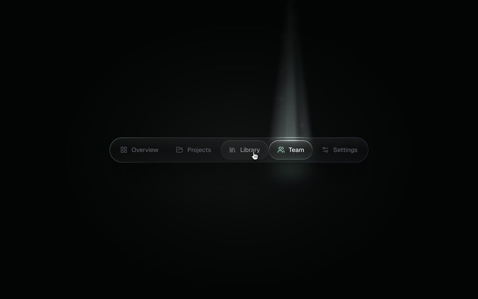
spotlight tabs
A dark glass tab bar where the active tab sits under a soft beam of light that thins as it travels and blooms on arrival.
copy its prompt on uberdesigner
Questions and answers
Should a menu prompt include the page around it?
A plain shell is enough: a header, a content area and some filler. The menu needs something to open over, and you need to see how it sits against real edges, but the page itself should stay quiet.
How do I add a generated menu to an app that already has routing?
Tell the tool which router the app uses and where the routes are defined, and ask it to wire each item to an existing route. Without that, it will build the menu with links that go nowhere.
Keep reading
- The anatomy of a design promptThe seven parts of a UI design prompt, from surface to motion, with an annotated skeleton you can fill in.
- One look across many screensHow to keep several AI-built screens in one design system: write the tokens once, give them to every prompt, and take the look from a family of pieces, not one.
Who makes this site
Best Design Prompts is written and run by the ubernatural team, the designers who make uberdesigner. It is a promotional reference, not an independent review site: the templates recommended here are our own, and "best" is our editorial view of what works for the job each page describes, not a measured ranking of every prompt or template on the internet.
Cite this page: Best Design Prompts, “Menu and navigation prompts”. Reviewed 11 November 2026. https://bestdesignprompts.com/menu-and-navigation-prompts/