prompt topic
Widget design prompts
Answer in brief
A widget prompt works when it gives each widget one fact, fixes the size in pixels, and describes a single style that the whole set shares. A widget is small, so every value shows: an 18px radius next to a 22px one reads as a mistake.
Ask for a set of three or four in one prompt. One widget alone proves little, and a set forces the model to keep the padding, type and radius consistent.
One fact per widget
A widget answers one question: how warm is it, what is playing, how long until the meeting. Write that question for each widget, then the single value that answers it and at most two supporting details. If a widget needs a scroll bar or a tab, it has become a screen.
Give the value in its natural form. A temperature is a large number. A timer is a ring or a bar that empties. A track is a cover, a title and a progress line. Naming the form stops the model from turning everything into a label and a number.
Fix the box before the contents
State the sizes: small 170 × 170px, wide 356 × 170px, with a 16px gap, for example. State the padding and the radius once and say every widget uses them. Then set a type scale of three sizes at most. Small surfaces fall apart quickly when each one picks its own numbers.
Describe the material and what is live
A widget set is usually remembered for its material: paper, frosted glass, dark enamel lit from inside. Describe it in terms of what the CSS has to do: the fill, the border, the shadow or the glow, and what sits behind. How to describe a visual style has the vocabulary.
Then say what changes over time. A clock ticks, a value updates every few seconds, a progress line advances. Give the interval and how the change is shown, so the set feels live without a camera move or a big animation.
What a widget design prompt should contain
- The set: how many widgets, and the one fact each shows.
- Sizes: each widget's width and height, and the gap between them.
- Shared values: padding, radius and a type scale of up to three sizes.
- The material: fill, border, light and what is behind the widgets.
- Live behaviour: what updates, how often and how the change looks.
- The stage: the background, how the set is centred, and the phone layout.
A prompt to start from
Build a set of four widgets for [subject, e.g. a home weather station], shown together on one page as a design study.

Stack: Vite + React + TypeScript, plain CSS with custom properties. No libraries. Icons are inline SVG, 1.5px stroke.

Stage: page background #e9e6df. The set sits centred in the viewport on a 2 × 2 arrangement with a 16px gap: two small widgets (170 × 170px) on top of one wide widget (356 × 170px), and one more small widget beside it.

Shared style, used by every widget without exception: fill #f7f5f0, 1px border rgba(0,0,0,0.06), radius 28px, padding 18px, shadow 0 1px 2px rgba(0,0,0,0.05) and 0 12px 24px -12px rgba(0,0,0,0.12). Text #1c1b19, secondary #86827a, one accent [#hex] used on a single element per widget. Type: [typeface]. Value 44px/500 with tabular figures, title 13px/500, caption 11px.

Widgets:
1. [Fact 1, e.g. outdoor temperature]: title top left, the value large at the bottom, a caption with [detail].
2. [Fact 2, e.g. humidity]: a 96px ring, 8px stroke, filled to the value in the accent, the number inside.
3. [Fact 3, e.g. the next 12 hours], wide: twelve small bars, 8px wide with rounded tops, the current hour in the accent, hour labels under every third bar.
4. [Fact 4, e.g. wind]: a compass needle that points to the direction, the speed under it.

Live behaviour: every 4 seconds one value changes by a small realistic amount. Numbers roll to the new value over 0.5s, the ring and the needle ease to it over 0.8s with cubic-bezier(0.2, 0.8, 0.2, 1).

Phones: below 420px the set becomes one column, each widget full width with the same height. With prefers-reduced-motion, values swap with no animation.

Run it and check that all four widgets share the same padding, radius and type sizes at 390px and 1280px.
Written for this page as a starting point; swap the parts in [brackets] for your own. The full prompt of each uberdesigner template is longer and specific to one finished design, and it is tested by rebuilding the template from the prompt alone.
What this prompt built
We ran the prompt above once in Claude Code, with the brackets filled in for an invented brand, Saltmark. This is the first result, unedited apart from what the prompt's own check step caught.
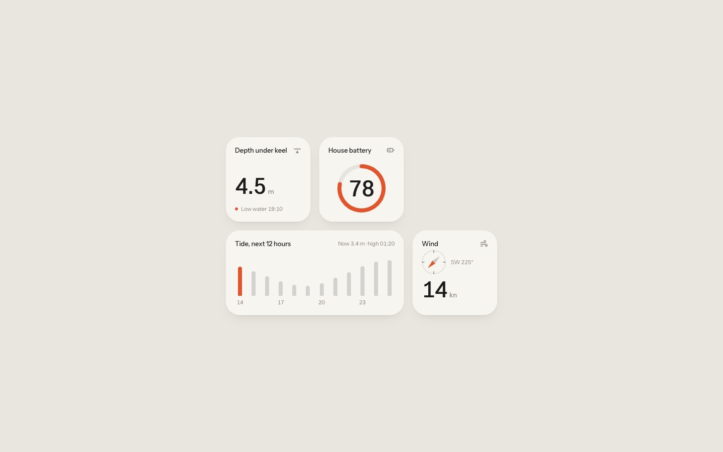
- Filled in
- Subject: cabin instruments for a small sailing boat, called Saltmark; accent #e2552b, typeface Instrument Sans; the four facts are depth under keel (caption: next low water), house battery, the tide over the next 12 hours, and wind.
- Where it falls short
- Followed literally, the layout leaves an empty slot top right; the compass is only 48px to fit above a 44px speed and sits tight under its title; and between 420px and about 575px wide the three-column set is wider than the screen, a range the prompt never mentions.
Widget sets to start from
Finished widget sets and single widgets on uberdesigner, each in one material. Home widgets, glass widgets and paper widgets are free.
-
home widgets
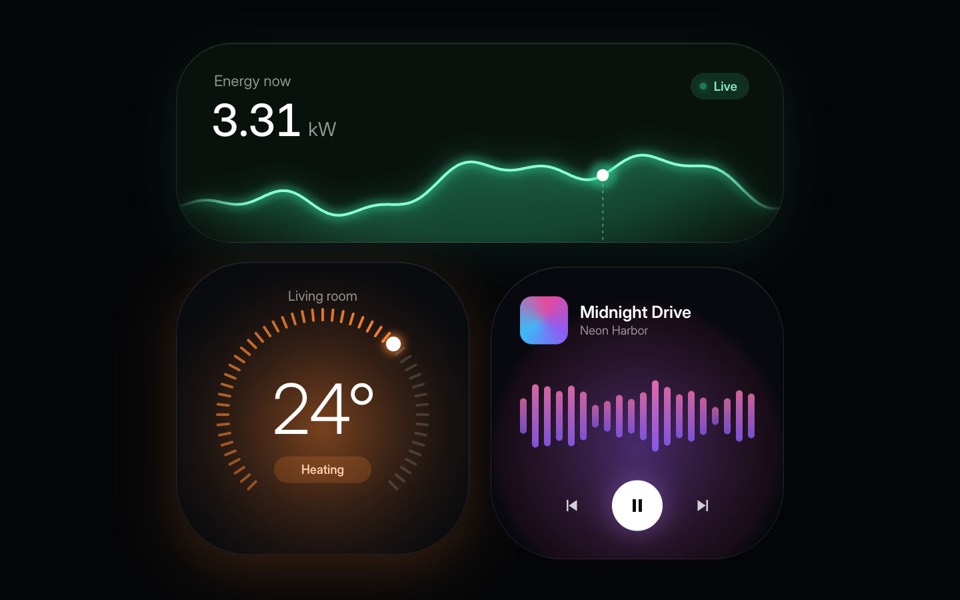
Three glowing smart-home widgets: live energy use, a thermostat dial and a music player.
copy its prompt on uberdesigner -
glass widgets
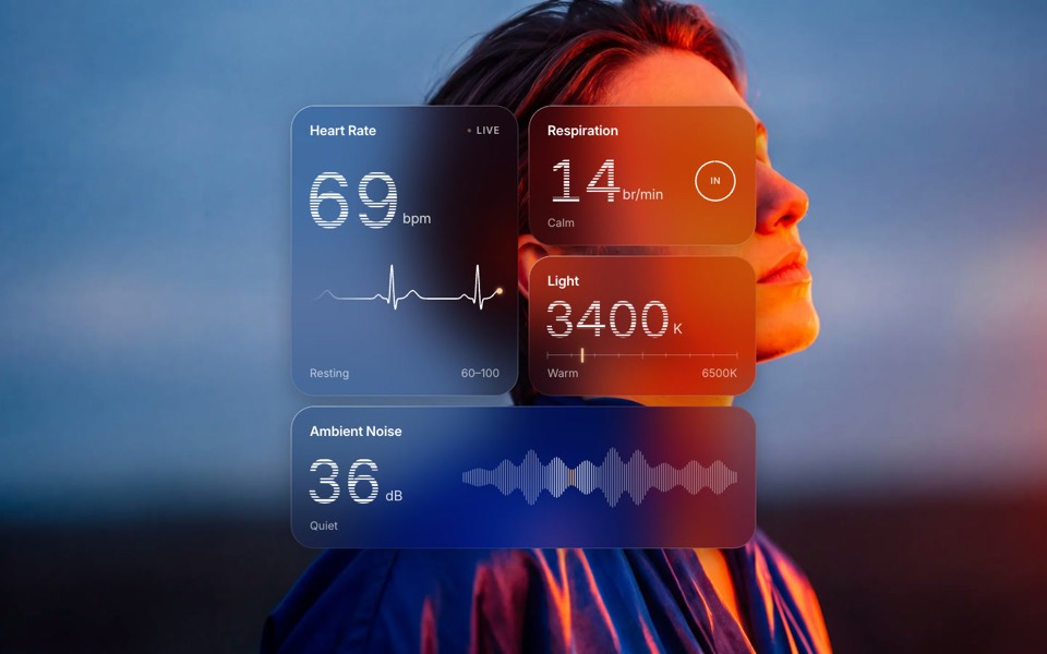
Four frosted-glass health widgets over a portrait lit blue and orange, with numbers that tick live.
copy its prompt on uberdesigner -
paper widgets
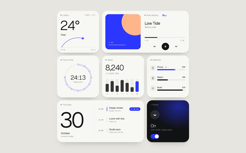
Seven everyday widgets in one paper-white style with a single ultramarine accent, on an 11-second loop.
copy its prompt on uberdesigner -
day calendar
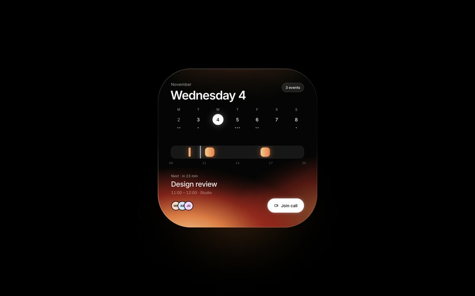
A dark calendar widget lit from inside: the light follows the selected day, from Wednesday's ember to Friday's cobalt.
see it on uberdesigner -
split bill
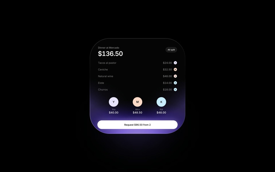
A dinner bill split in motion: items fly from the receipt to the people who had them, inside a dark widget lit in iris violet.
see it on uberdesigner -
brumavel
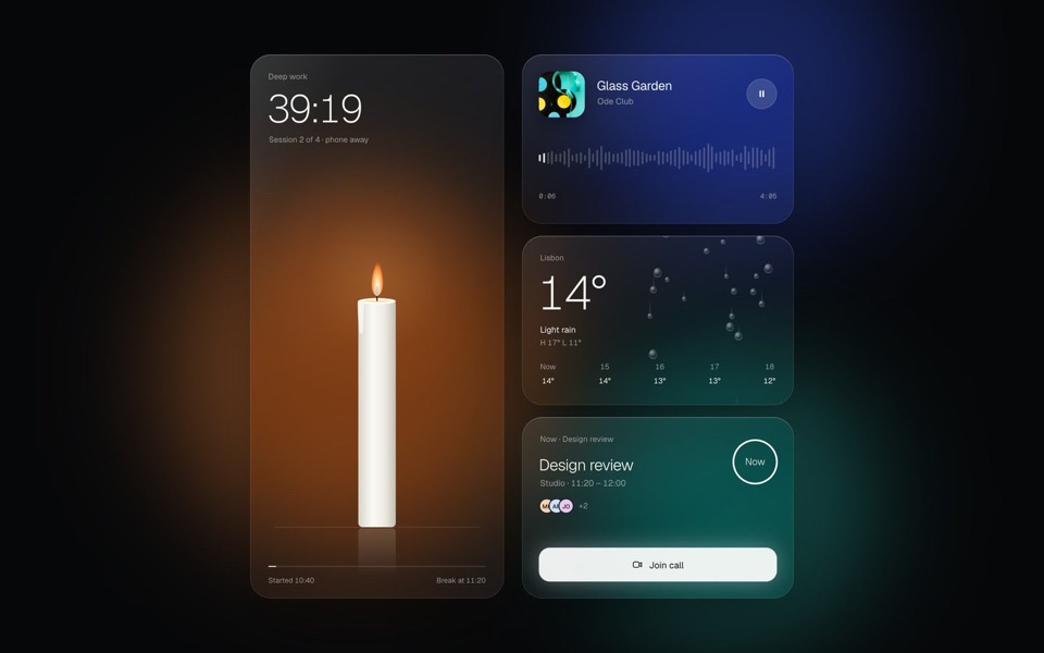
Four frosted-glass widgets over drifting light: a candle timer, now playing, rain and a meeting countdown.
see it on uberdesigner -
light widgets
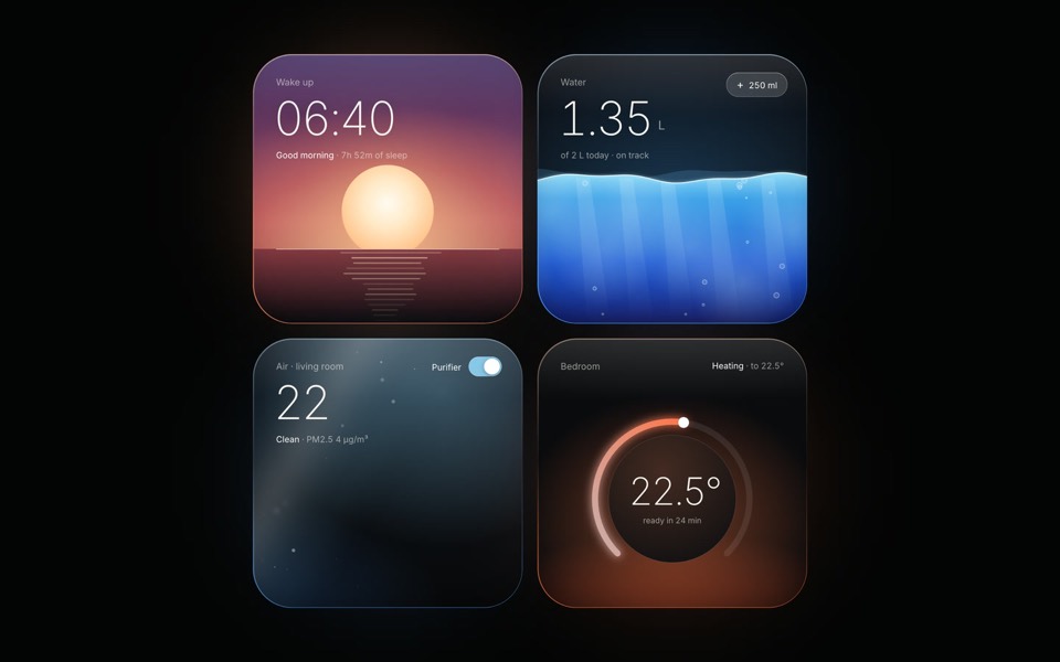
Four dark widgets lit from inside: as each one changes state, its light, rim and glow change with it.
see it on uberdesigner -
tactile widgets
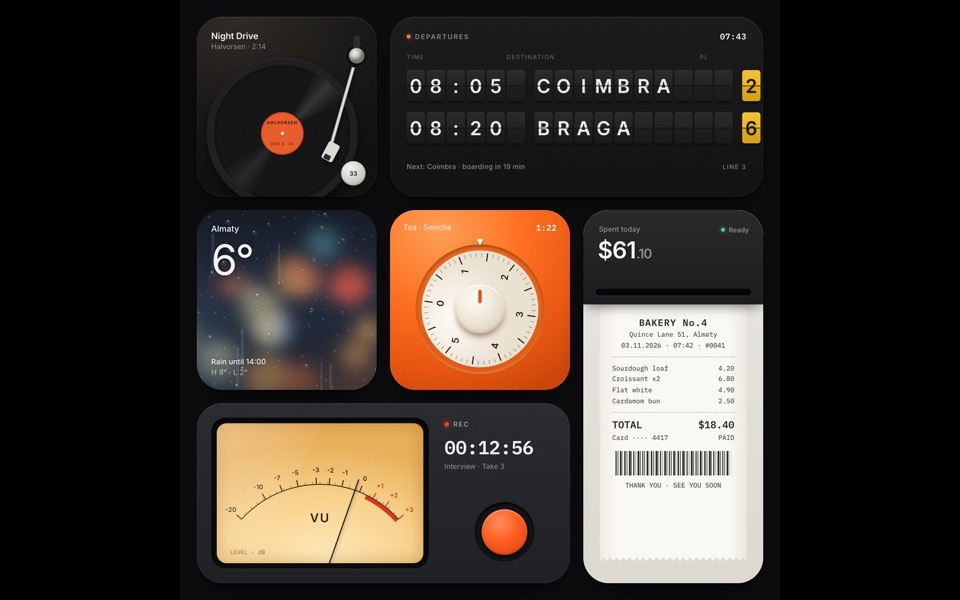
Six widgets that are small physical things: a turntable, a split-flap board, rain on glass, a tea timer, a receipt printer and a VU recorder.
see it on uberdesigner -
glow widgets
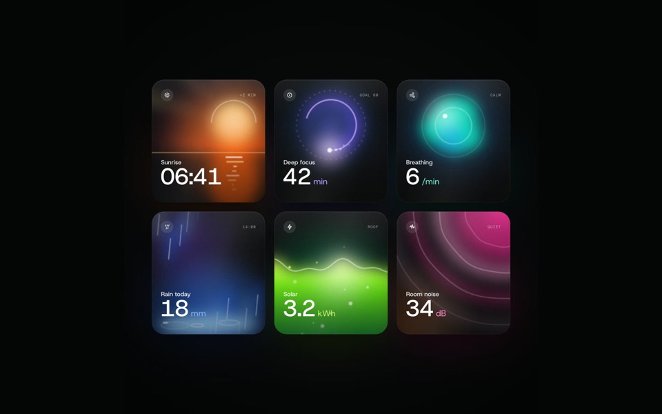
Six dark widgets with a living light inside each, filmed by a camera that flies through them in one take and settles on the grid, on a 12-second loop.
see it on uberdesigner
Questions and answers
Are these widgets for a phone home screen?
The prompts here build widgets as web components in React, for a product page, a dashboard or a design study. Native home-screen widgets are built with each platform's own tools, though a web study is a quick way to settle the design first.
How many widgets should one prompt ask for?
Three to six. Fewer and the shared style is not tested; more and the tool starts to repeat itself or thin out the detail.
Keep reading
- How to describe a visual style to an AI toolThe vocabulary a model acts on when building UI (materials, light, density, edges) and the adjectives it ignores, with a style block to copy.
- One look across many screensHow to keep several AI-built screens in one design system: write the tokens once, give them to every prompt, and take the look from a family of pieces, not one.
Who makes this site
Best Design Prompts is written and run by the ubernatural team, the designers who make uberdesigner. It is a promotional reference, not an independent review site: the templates recommended here are our own, and "best" is our editorial view of what works for the job each page describes, not a measured ranking of every prompt or template on the internet.
Cite this page: Best Design Prompts, “Widget design prompts”. Reviewed 11 November 2026. https://bestdesignprompts.com/widget-design-prompts/